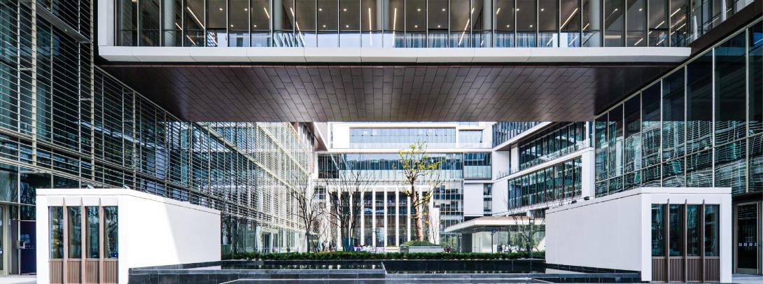
As we explore and get acquainted with our new campus, Principal Jill Lerner and Design Partner Elie Gamburg of the design firm Kohn Pedersen Fox share how they worked together with NYU Shanghai to bring their vision for the New Bund Campus to life.
What was your vision for the New Bund Campus?
JL: We very quickly felt that it wasn't the right strategy to have three separate “silo” buildings, such as faculty, research, and teaching. The whole fundamental idea of the campus is to have interconnected departments. So while we do have concentrated areas of science, of business, of theater, etc - you can weave the whole thing together providing opportunities for collaboration between disciplines.
There are wide corridors, lots of places where you can sit, emphasis on stairs so people can move up and down and see each other. Wherever you're moving through the building, you're looking out onto the courtyard. You can see across; you can see what's happening. You feel like you're part of this community. You can really have a level of interconnectedness.

KPF’s Jill Lerner, principal (left) and Elie Gamburg, design partner (right).
How did you use design to highlight NYU Shanghai’s unique characteristics?
EG: We were very cognizant of the fact that we were designing an international bi-national institution. For us, it is a very interesting intellectual and creative problem – one that is really central to what the institution is and clearly articulated by the senior administration from the very beginning. We began by looking a lot into the history of the two great academic traditions: the western ‘collegiate quad’ and the eastern ‘scholars garden’.
There is an inherent ambiguity in saying a design for something like NYU is “both and” – but clearly the design learns from both traditions. Both traditions have the same latent tension - the idea of academic and intellectual seclusion but also this idea that a school is fundamentally a place for exchange, bringing people and new ideas in.
Every university should have a quadrangle or a garden at the heart. The courtyard immediately created four sides, four buildings, and then we opened those four buildings to create these four gateways. The courtyard building is the western idea of a cloister, the garden in the middle is simultaneously the quad as well as the eastern garden, and the gateways are from the Chinese scholars’ villas that you see a lot in places like Hangzhou. We naturally find the synergies of how the gateways can be representative of New York (the NYU arch) but also NYU in Shanghai.
How do you design a campus for present as well as future use?
JL: One thing we learned by doing the Century Avenue campus was that the curriculum will change over time. It needs to be a robust campus with a lot of flexibility. That means that in the future, if one department grows and another shrinks, you have the ability to change the interior within the framework of the building envelope.
EG: You have to create a space that is going to be inviting and you also have to acknowledge that the space is going to be used in ways that you can imagine and ways that you cannot.
This idea of inclusion has shifted from a kind of box-checking thing to saying very fundamentally that different ages, different cultures, and different people use space in different ways. Graduate students study differently than undergraduates, faculty want time to be with students but also with each other. There are different ways that different social groups use the space – and the spaces we designed had to suggest multiple patterns of use but also be open to other interpretations.
We made sure that every space does double-duty. We encourage people to mix and collaborate. It was an organizational idea that we tried to make a physical one. Everything is connected. [The campus design] becomes a flexible idea. Those buildings can flex and adapt over time. So we worked closely with NYU Shanghai leadership as to what these buildings could be for now but that they also had to be designed for a 10-year, 50-year, even 100-year life cycle.
What decisions did you make when choosing materials?
We wanted to make sure that the design was a tactile and visually enriching experience. We asked what are the materials that inherently have significance in terms of a sort of Sino-American architecture? For example, gray ash brick is so typical of Shanghai Lilong – and so all the elevator cores use that brick so you can always find where the elevators/stairs are. Wood is also a big part of academic architecture in America and also there is a great history of different kinds of wood in China. All the different programs use slightly different colors of wood. In the performing arts area, it is very dark and ‘mahogany-like’. You get up to the labs and it is practically like a white pine. And then you get to the more academic, teaching spaces and they are more of a cherry wood.
How does the campus design fit within the surrounding community?
It is an integrated piece of architecture. The ‘interior design’ is fundamentally a continuation of the outside. It is like a geode: the outside creates a sort of civic presence, and when you open it to the inside, the architecture becomes this soft, transparent thing that opens the interior of the campus to the courtyard. The beauty is that because of the arches, the gateways are so open. Even when you are on the outside, you are seeing into the courtyard – you are seeing into the building that is large and transparent.
What are some of your favorite spaces on campus?
EG: One moment architecturally is the corner study and reading room with a cascade of stairs coming up from below, and the library stairway that flies over the other stairways in the space (both cohabiting the same volume but separately because one stair is for student studying and one is for connecting spaces behind library security). All the students studying are in the same space at the same time. It has the bookcase, and it has this great terrace and glass so you can see over Qiantan, but the people driving by can also look in. I think that encapsulates all of the vision for the project and it is probably the space we labored over the most as a team. When you are there in the reading room, it really feels like the campus came together.
My favorite moment, personally, is when you stand in the courtyard, and there is a moment where you can see the great tree, the arcade of the great auditorium, and there are all these study lounges [in the North building], and you see people just hanging out in them like ‘birds on a wire’ (our affectionate term for that moment). And then you have the main auditorium entry columns – which feel very classically civic. So, it becomes the quintessential campus experience captured in that one moment.
JL: I also like the exterior courtyard, graced with a tree of such grandeur in this very dramatic location. It is very unique, very special, with its very tall, substantial trunk. It is both monumental and symbolic, in its connection to history and to a place of learning.
Is there anything you’d do differently?
EG: This building came together in the middle of COVID-19. I wish we could have worked more closely and collaboratively with the local team, because obviously it’s that transition from concept to execution that is really important and that, of course through no fault of anybody’s, was abridged a little bit because of COVID. Overall it’s amazing that this managed to happen at a time when travel was so difficult.
JL: COVID definitely added complications, but we are so grateful to our Shanghai office who came out quite regularly. They did so much to make sure it was built as intended. Of course, as the students and faculty use the new campus, we don’t know how it will evolve. But hopefully there’s enough flexibility built into the design that it will absorb changes over time, adjusting to support an evolving university.


